

See all the angles

Print placement (appearing in The Wall Street Journal)
Client
The News Literacy Project
Role
Senior designer, type designer
Description
The nonpartisan organization News Literacy Project works with educators to teach kids how to sort fact from fiction in the age of fake news.
We designed a “sideways” font that put a literal spin on the alphabet to remind readers to dig deeper into headlines and to look for hidden angles before sharing potentially false stories. The time it takes to decipher the font mirrors the critical eye that young readers should apply to everything they read in the digital era.
The font was used in a multi-faceted awareness campaign, including ad placements in online and print publications that were most affected by fake news (both red and blue leaning) including CNN, Fox News, USA Today, AOL, and The Wall Street Journal. Other initiatives included a mobile app, a poster series, and shirts.
Case study video

Web banner placements (appearing on CNN and Fox News)
Results
The non-profit organization had no budget for the campaign so the ad placement strategy relied solely on donated media space. However, news organizations were enthusiastic about the fight against fake news and the result was nearly 6 million impressions in donated media.
The News Literacy Project experienced a click-through rate of .12%, doubling the industry benchmark.
The campaign also caused a splash in advertising media, with coverage from organizations such as AdAge, AdWeek, the Digital Agency Network.

Custom font: “Alt News”

Poster, alphabet series

Poster, messaging series
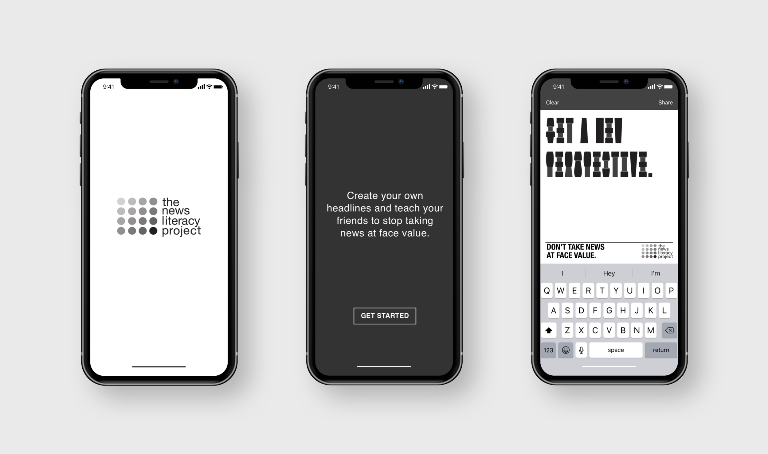
Mobile app for creating content with the custom font

Instagram post by AdWeek

A few social media responses about the campaign
Credits
Aaron Padin, design director
Jessica Toye, art director/writer
Greg Erdelyi, executive creative director
Brent Choi, chief creative officer
Jake Lavenberg/Victor Sima, WFT Productions LLC, developers
Halle Biggar, MetaVision Media/Mike Manzi, Kargo/Nicholas Puglisi, GroupM/Joseph Tam, MetaVision Media, managers of media services
Ray Cruz, Cruz Type Design, typographer
Catalina Condon, project manager
Andrew Magrini, strategist
J. Walter Thompson New York, ad agency
Erika Hobbs/Alan Miller/Darragh Worland, News Literacy Project, clients